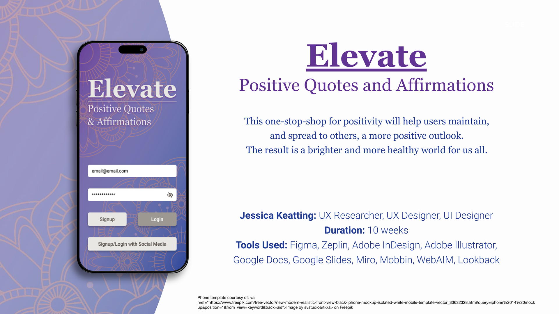
Project: Elevate — Positive Quotes & Affirmations Mobile App
My Role: UX Researcher · UX Designer · UI Designer
Duration: 10 weeks
Tools: Figma · Zeplin · Adobe Illustrator · Adobe InDesign · Miro · Mobbin · WebAIM · Lookback · Google Docs
My Role: UX Researcher · UX Designer · UI Designer
Duration: 10 weeks
Tools: Figma · Zeplin · Adobe Illustrator · Adobe InDesign · Miro · Mobbin · WebAIM · Lookback · Google Docs
Mental wellness is a daily practice, not a destination — yet most people lack a dedicated, intuitive space to access and personalize the positive content that supports their mindset. Elevate is a mobile application concept designed to help users discover, organize, and share positive quotes and affirmations in a way that feels personal, frictionless, and genuinely uplifting.
This project challenged me to move through the complete UX design process — from initial research through iterated, tested prototypes — while making intentional design decisions grounded in real user needs rather than assumptions.
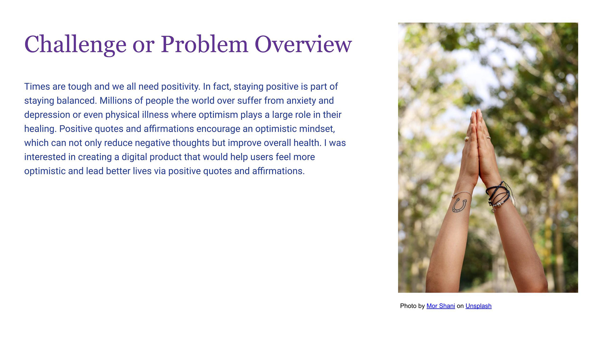
The Problem
Anxiety, depression, and low self-esteem affect millions of people globally, and research consistently supports the role of positive reinforcement in improving mental outlook and resilience. Yet existing platforms that surface inspiring content are fragmented — tucked inside social media feeds full of noise, or buried in apps that feel generic and uninspiring.
The design challenge: Create a mobile experience that makes positivity accessible, searchable, and personally meaningful — without overwhelming the user or competing with the content itself.
Discovery: Research & Analysis
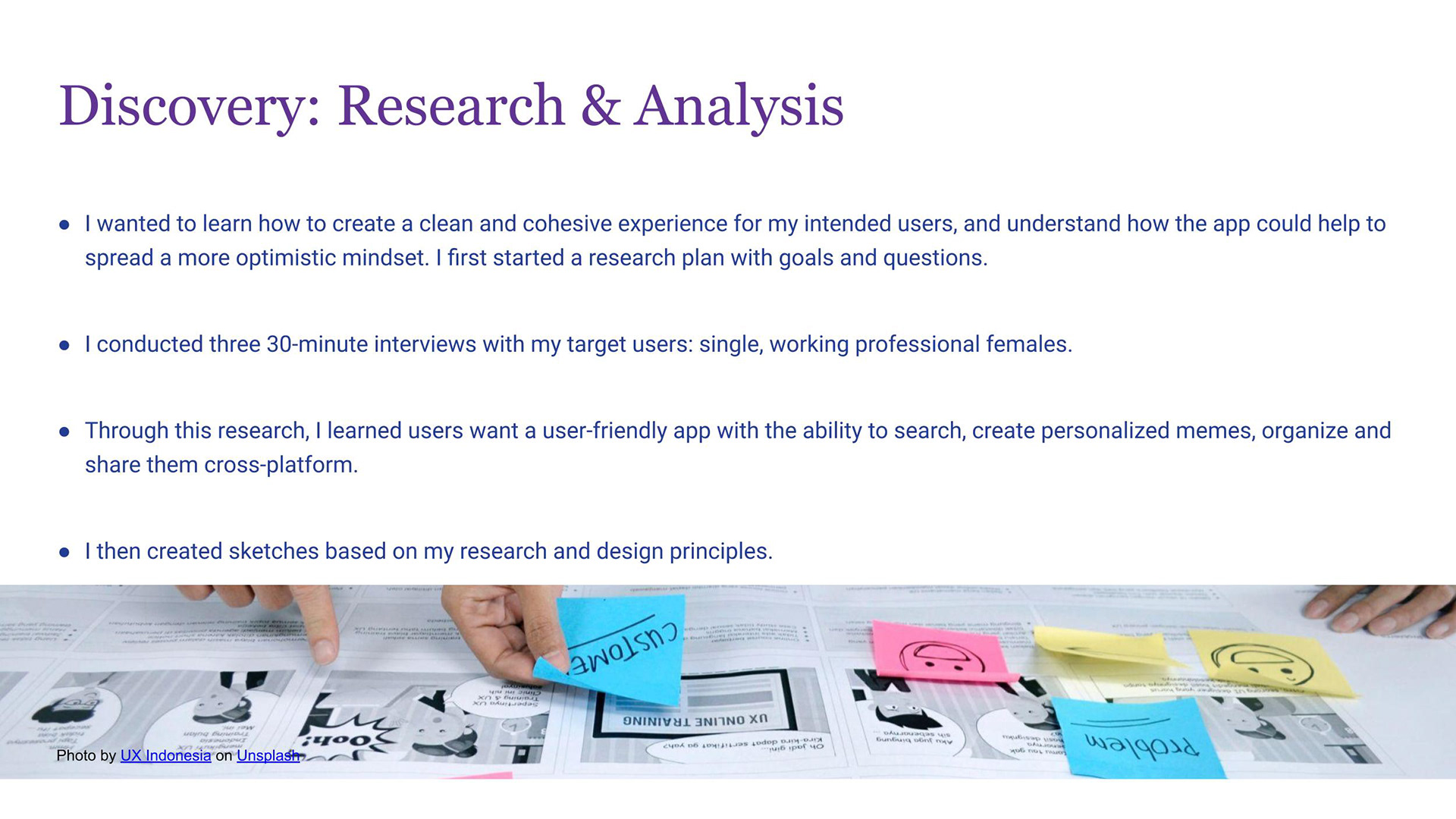
I began with a structured research plan, defining clear goals and questions before conducting three 30-minute user interviews with members of my target demographic — single, working professional women balancing full-time careers with personal wellness goals.
Key research questions centered on:
- How do users currently seek out positive or motivational content?
- What friction points prevent regular engagement with that content?
- What features would make a dedicated positivity app genuinely useful in daily life?
What I heard: Users wanted more than passive consumption. They wanted to do something with the content — save favorites, organize by theme, personalize the presentation, and share meaningful quotes with people they care about. The search experience was also consistently named as a priority; users felt frustrated when they couldn't find content by author, topic, or keyword.
These conversations shaped every subsequent design decision.
Synthesis: From Research to Direction
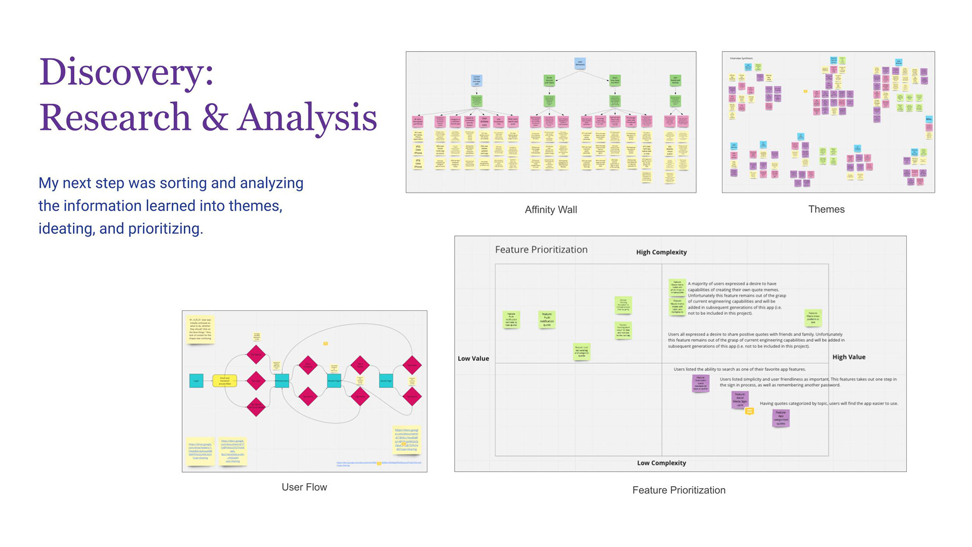
I organized interview findings using an affinity wall in Miro, clustering observations into themes that revealed the underlying user needs beneath surface-level requests.
From those themes, I developed a user flow mapping the end-to-end experience — from onboarding through daily use — and used a feature prioritization matrix to evaluate ideas against two axes: user value and implementation complexity.
This process surfaced a clear product direction:
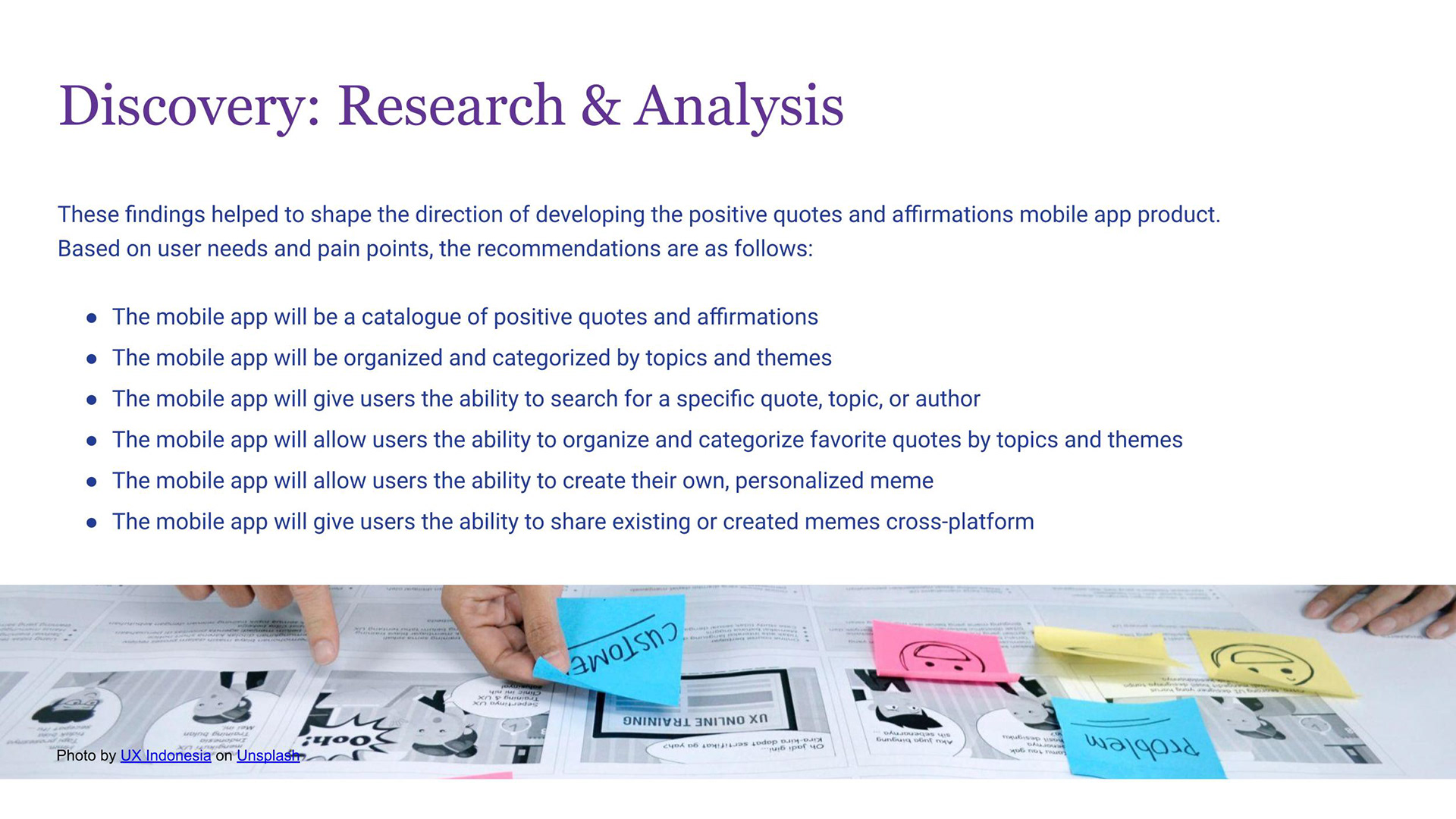
- A searchable catalogue of positive quotes and affirmations, organized by topic and theme
- Personalized organization: users can save and categorize favorites
- A meme creation tool allowing users to pair quotes with custom backgrounds and typography
- Cross-platform sharing so users can spread positivity to friends and family
- Social login to reduce onboarding friction — consistently named as a high-value, low-complexity win
Higher-complexity features (such as real-time social sharing of created memes) were deliberately scoped out of this iteration and documented for future development — a conscious product decision, not an oversight.
View my Miro Board here
Design: Concepts & Sketching
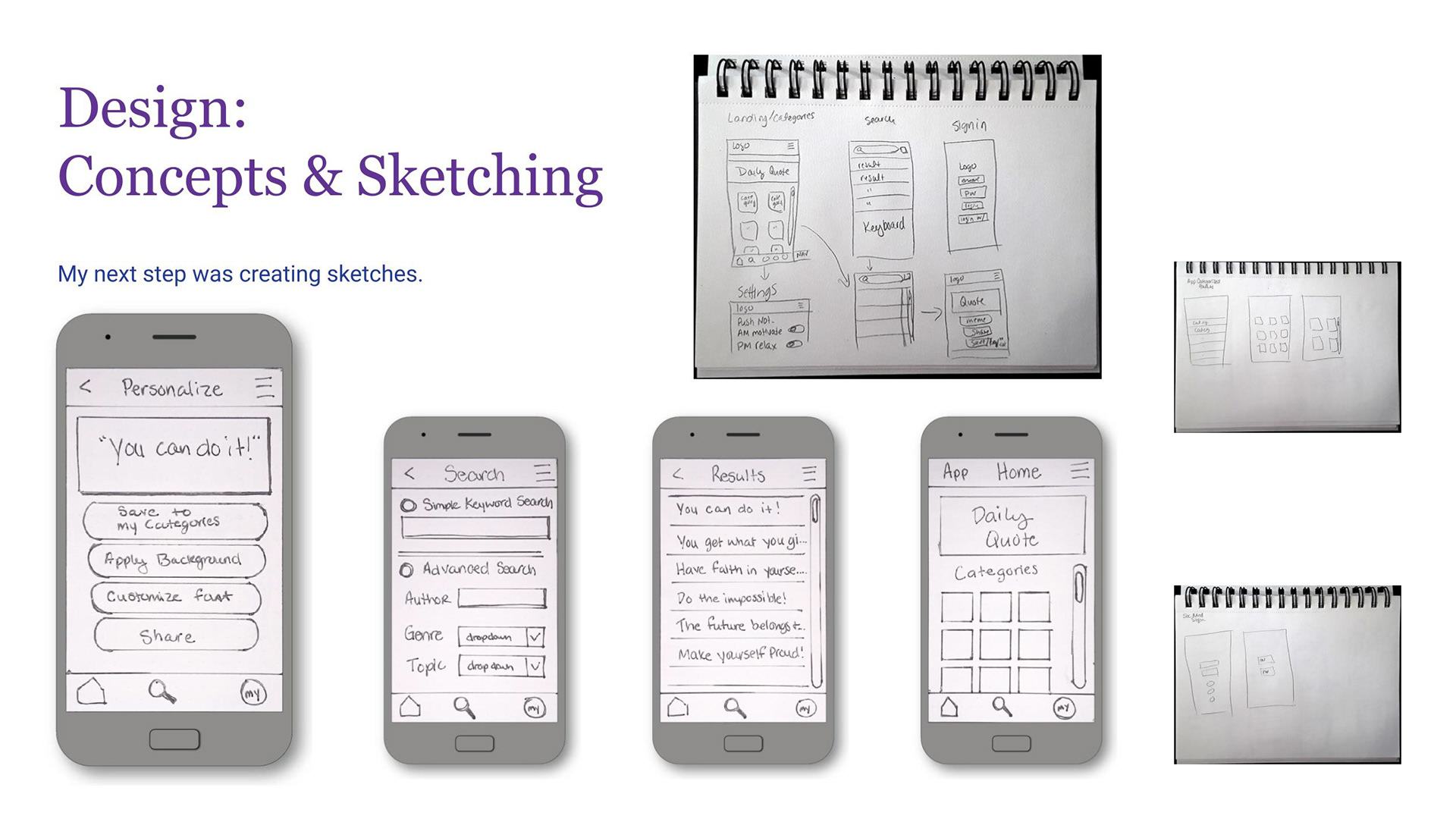
With a clear feature set and user flow established, I moved into sketching — translating research insights into rough screen concepts before touching any digital tools.
Sketching allowed me to explore multiple layout approaches quickly: navigation patterns, the home screen hierarchy, how search results and individual quote pages should be structured, and how the meme creation flow could feel intuitive rather than laborious. I explored several directions before converging on an approach that prioritized getting users to content immediately, with personalization tools always within reach.
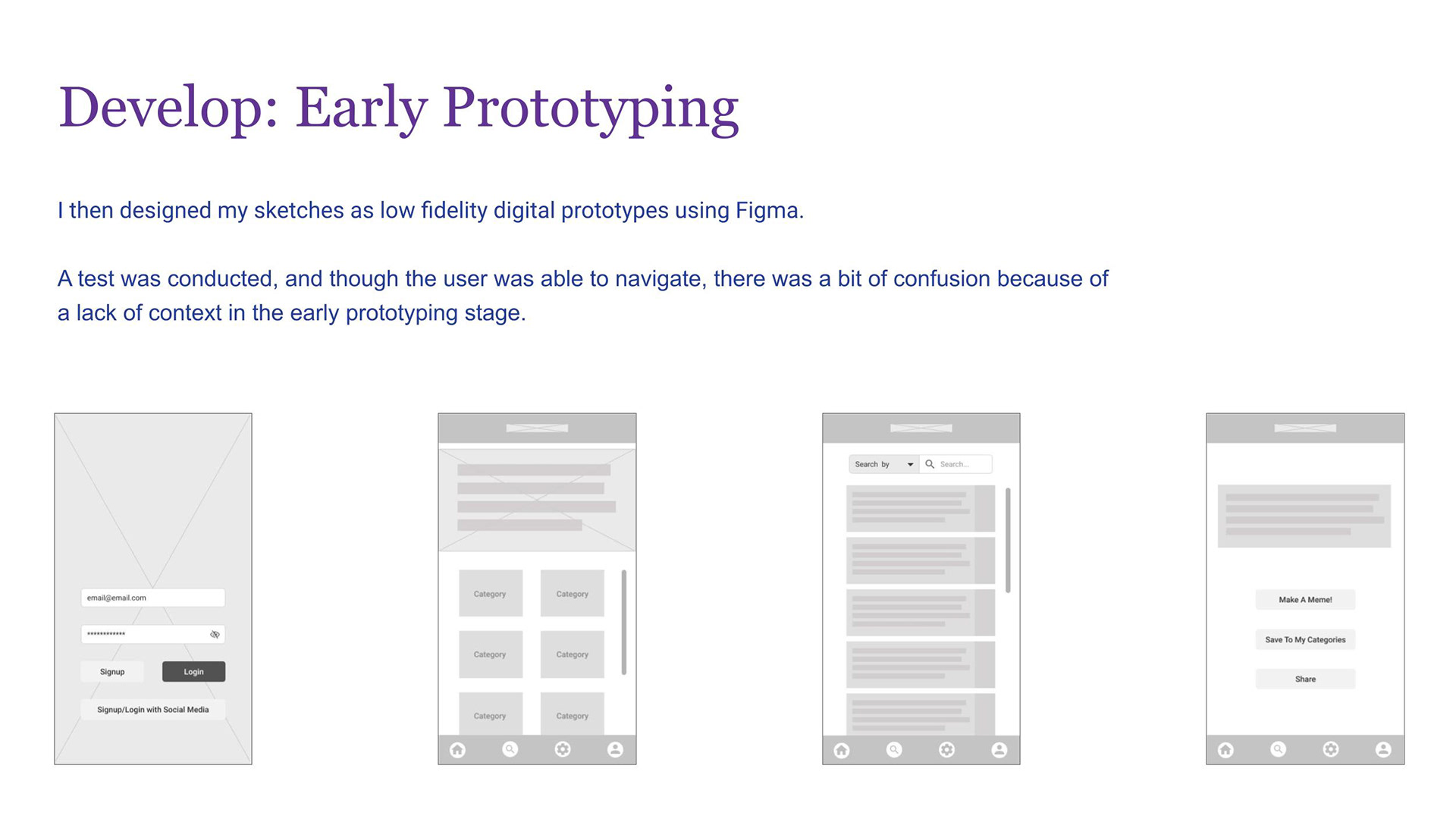
Develop: Early Prototyping & First Usability Test
I translated my sketches into low-fidelity digital wireframes in Figma, focusing on structure and flow rather than visual design at this stage.
I then conducted an initial usability test with a participant, asking them to complete core tasks within the prototype. The user successfully navigated the primary flows — but surfaced an important finding: the lack of contextual cues in a lo-fi prototype created confusion about what certain screens represented. This was expected, and valuable. It confirmed that visual hierarchy and content context would be critical in the high-fidelity phase — not just aesthetics, but orientation and clarity.
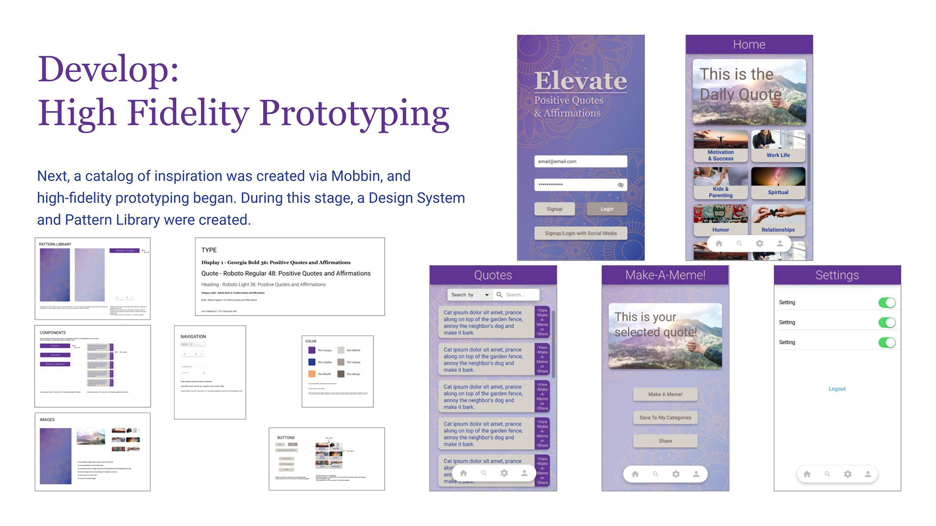
Develop: High-Fidelity Prototyping & Design System
Moving into high-fidelity design, I first built a competitive and inspirational catalog using Mobbin to ground my visual decisions in real-world mobile patterns and conventions.
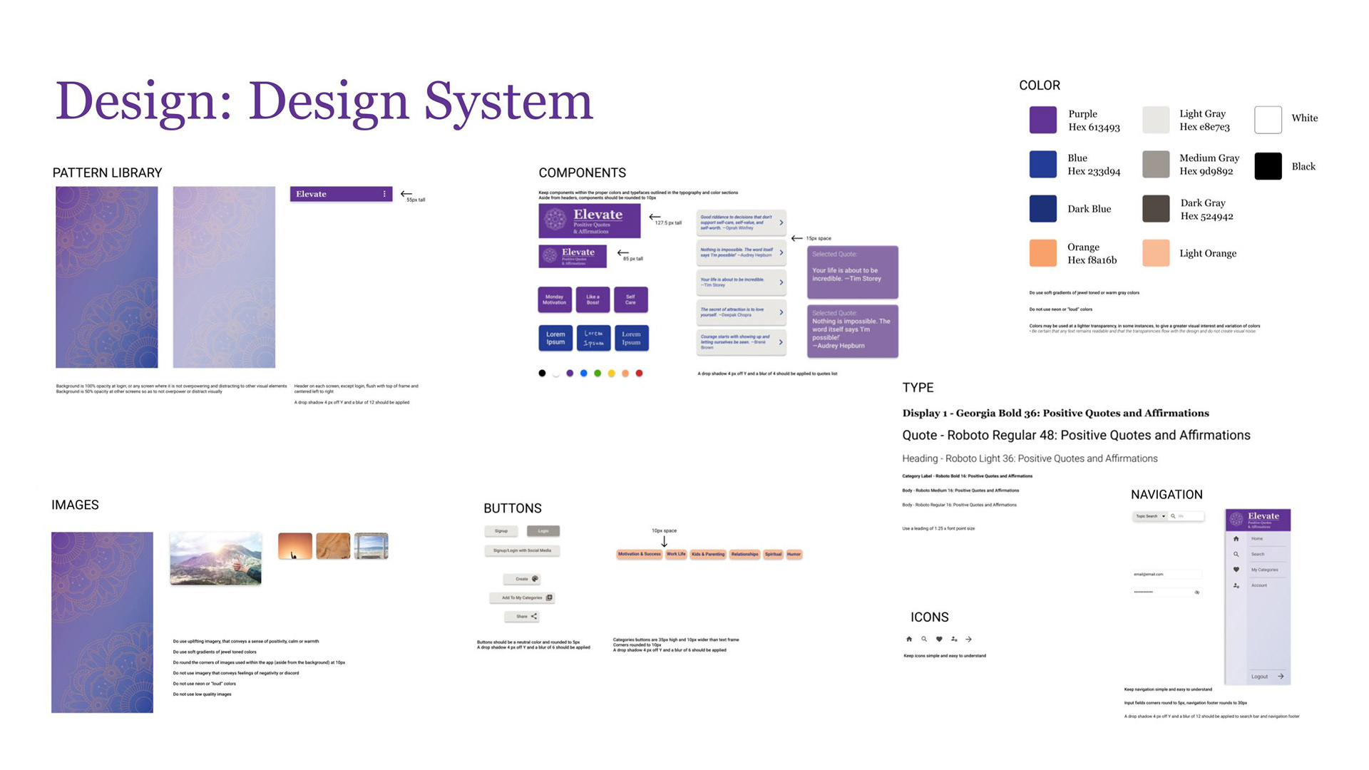
I then developed a full Design System before building any high-fidelity screens — establishing the foundational layer that would ensure consistency, scalability, and coherence across the entire app:
- Color System: A primary palette anchored in purple with supporting blues, grays, and warm oranges — chosen to feel calming and uplifting without reading as clinical or cold. Color usage rules defined to prevent overuse of "loud" colors and maintain visual tranquility.
- Typography Scale: Georgia Bold for display (personality and warmth), Roboto for UI and body (legibility and neutrality) — a deliberate pairing of character and clarity.
- Pattern Library: Background treatments at defined opacity levels to balance brand presence without competing with quote content.
- Component Library: Standardized buttons, category chips, quote list items, meme cards, and navigation elements — all with defined sizing, spacing, and drop shadow specifications.
- Icon System: Simple, universally recognizable icons to support navigation legibility across diverse users.
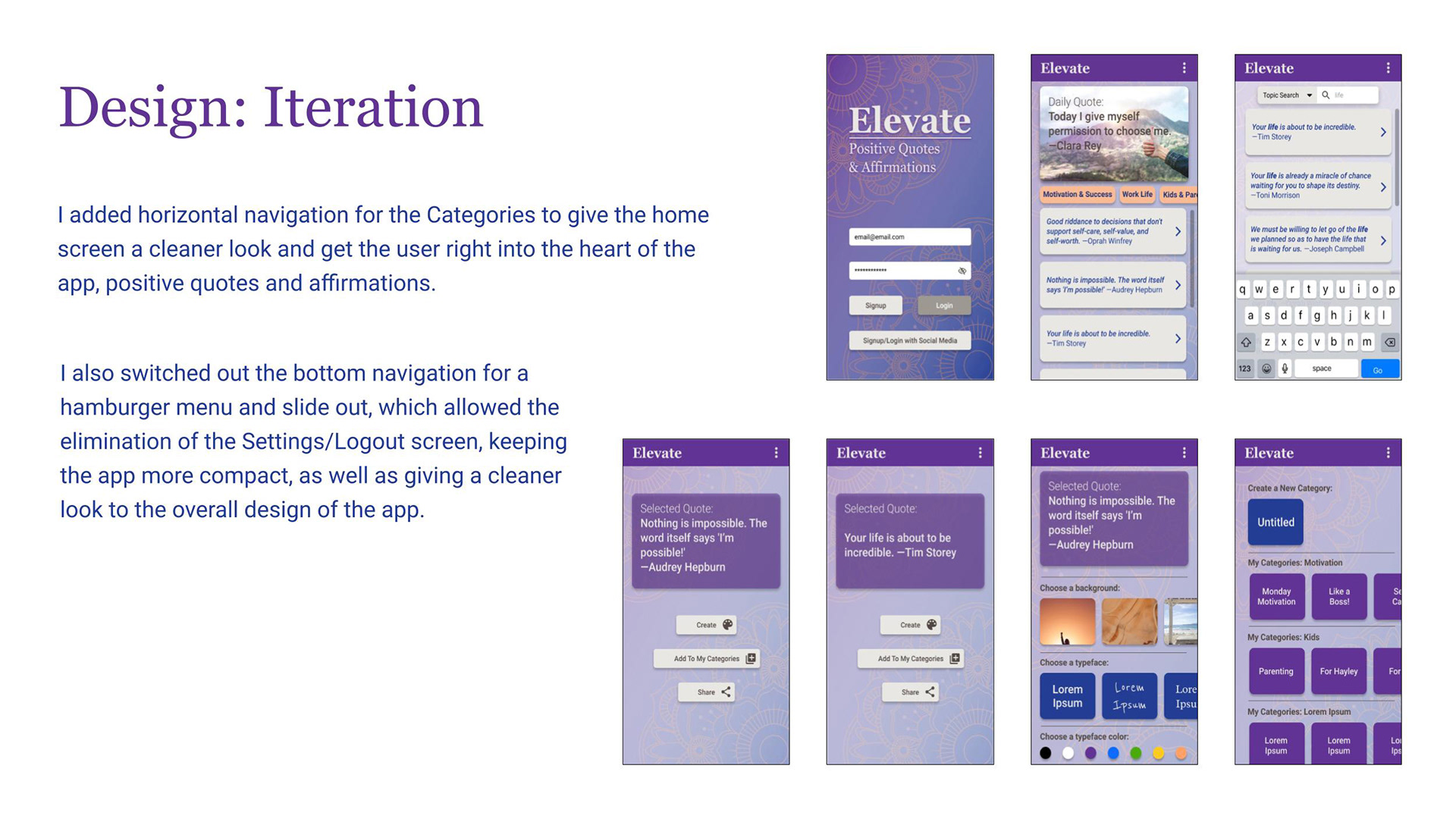
- Navigation: Evolved from a bottom tab bar (which added a redundant Settings screen) to a hamburger menu with slide-out navigation — reducing screen count, eliminating redundancy, and giving the home experience a cleaner, more premium feel.
This design system meant that every screen shared visual DNA, and any future designer or developer could extend the product without breaking consistency.
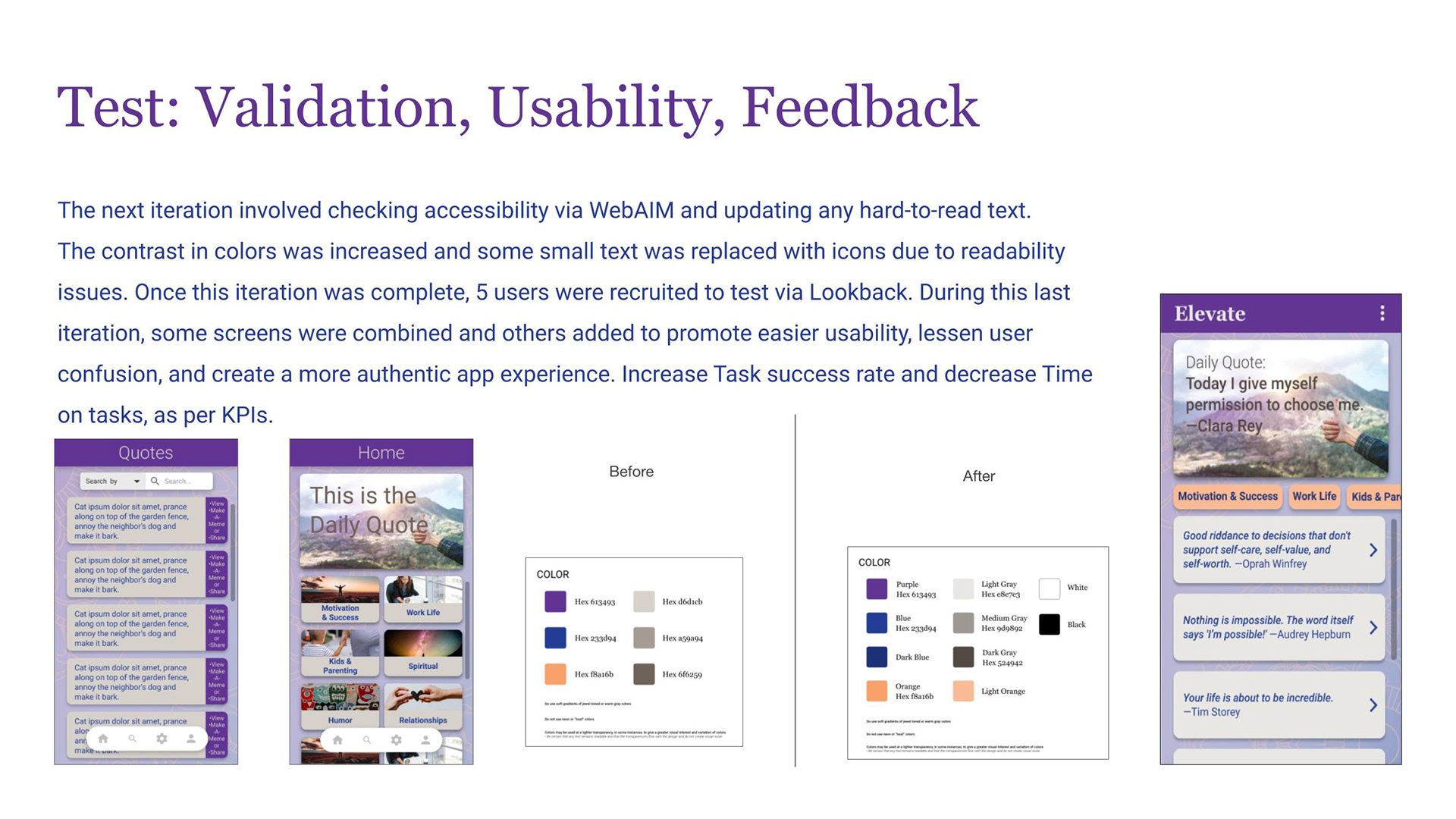
Test: Validation, Usability & Iteration
With high-fidelity screens complete, I ran accessibility validation using WebAIM, checking every screen for color contrast compliance. Several text elements failed contrast ratios — I increased contrast across the color system and replaced low-legibility small text with icons where appropriate. Accessibility was treated as a design requirement, not a final checklist.
I then recruited 5 users for moderated usability testing via Lookback, observing how real people moved through the prototype and where they hesitated, misread, or succeeded.
Testing informed a final round of intentional iteration:
- Horizontal category navigation replaced the grid layout on the home screen — getting users into content faster with less visual cognitive load
- Certain screens were combined to reduce unnecessary steps in key flows
- New screens were added where users expected content that wasn't there
- The overall result: measurably improved task success rates and reduced time-on-task across core flows
Every change was traceable to a specific user observation — not aesthetic preference.
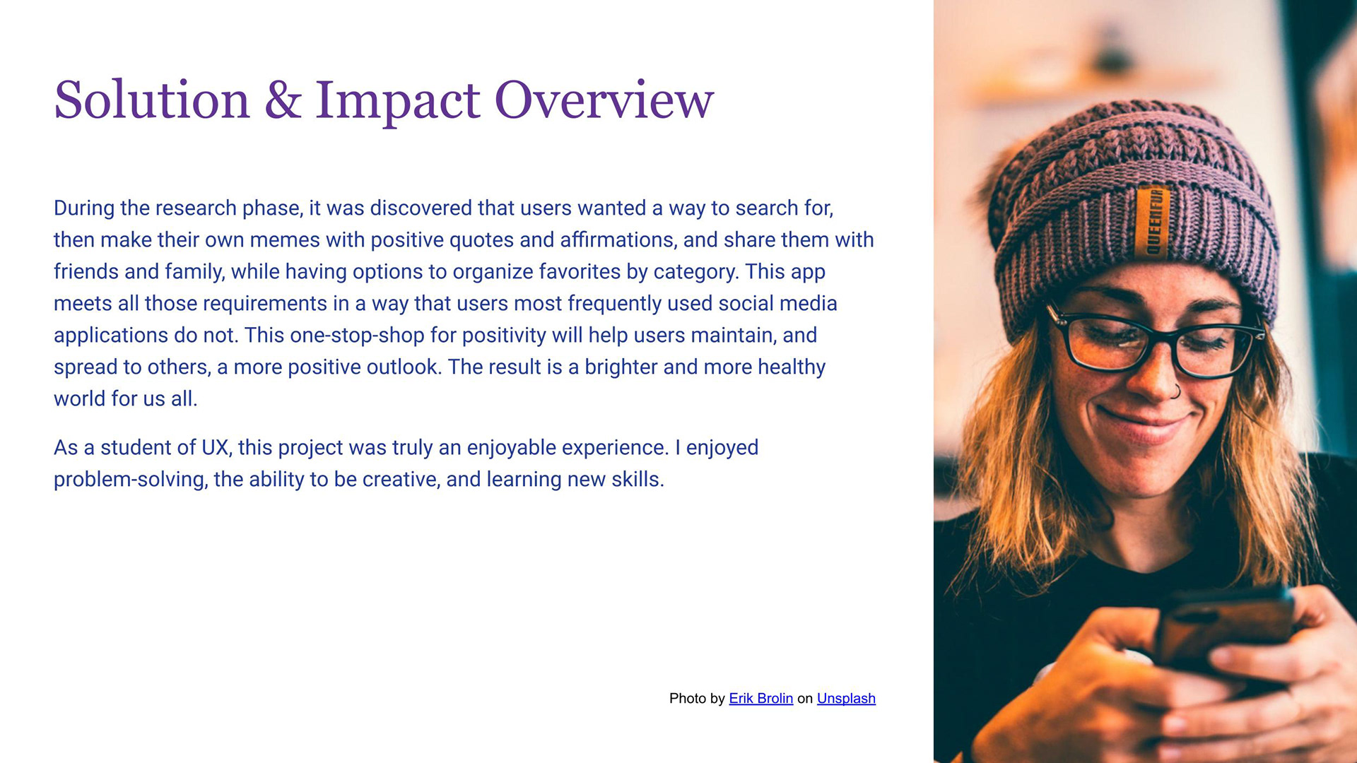
Solution & Reflection
Elevate delivers a cohesive, calm, and genuinely useful mobile experience for users who want more than a passive feed of inspirational content. The final prototype includes:
- A personalized home screen with a daily featured quote and category navigation
- Full search functionality by keyword, author, and topic
- Quote personalization: choose backgrounds, typefaces, and colors to create shareable meme graphics
- Organized "My Categories" for saving and sorting favorites
- Frictionless social login and a compact hamburger navigation that keeps the focus on content
What this project demonstrates: I can move through an end-to-end UX process with discipline — grounding design decisions in research, building systems that scale, testing with real users, and iterating based on evidence rather than intuition alone. The tools change by project; this process doesn't.