Project: Website Optimization — Florida Veterinary Medical Association
My Role: UX Researcher · UX Designer · Brand Specialist
Organization: Statewide nonprofit serving 6,000+ veterinary professionals
Tools: Google Analytics · Figma · ChatGPT · Adobe Creative Cloud
My Role: UX Researcher · UX Designer · Brand Specialist
Organization: Statewide nonprofit serving 6,000+ veterinary professionals
Tools: Google Analytics · Figma · ChatGPT · Adobe Creative Cloud
Optimizing the FVMA website’s navigation and CTAs, along with a registration button redesign, drove a 20% YoY increase in sign-ups and $1.1M conference pass sales, leveraging AI for scalable improvements. See the prototype below.
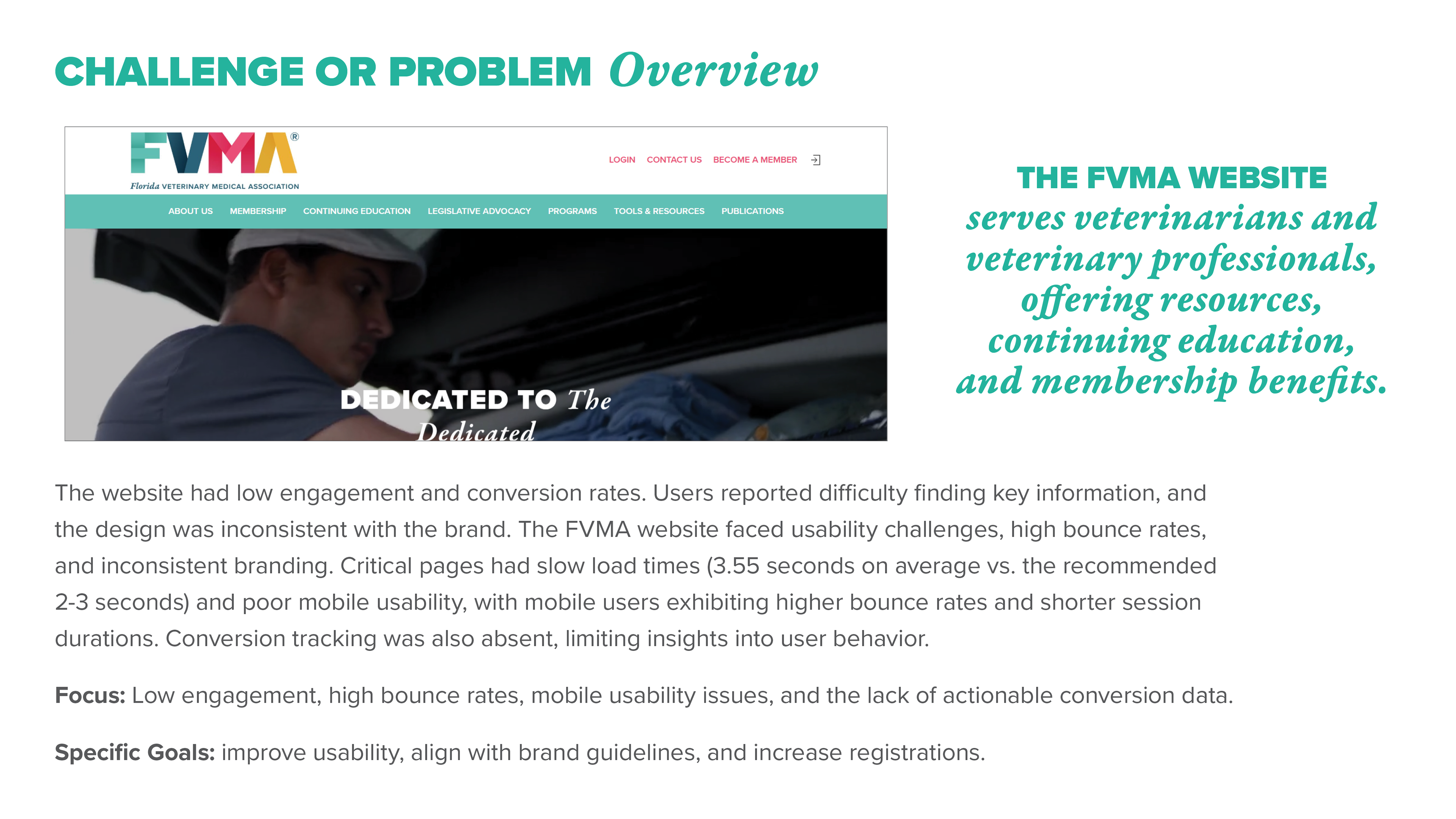
The Florida Veterinary Medical Association serves over 6,000 veterinary professionals statewide — veterinarians, technicians, assistants, and practice managers united by their commitment to animal health. Their website is the primary gateway to membership benefits, continuing education resources, and event registration for conferences drawing 1,000+ attendees annually.
When I joined FVMA, the website was quietly losing the organization money. Members couldn't find what they needed, mobile users were bouncing at high rates, and conference registration — a critical revenue stream — was underperforming. No conversion tracking existed, so leadership had no data to explain why.
My work changed that. By applying a rigorous UX research process and translating findings into targeted design improvements, I helped drive a 20% year-over-year increase in conference registrations and $1.1 million in conference pass sales.

The Problem
The FVMA website had measurable, documented problems — not assumptions:
- Page load times averaged 3.55 seconds on critical pages, exceeding the recommended 2–3 second threshold and contributing to user drop-off before content even loaded
- Key resource pages had bounce rates as high as 68% — meaning more than two-thirds of visitors were leaving immediately, signaling that the page wasn't delivering what users expected
- Conversion tracking was absent — the organization had no visibility into how users were moving through (or abandoning) the registration funnel
- Navigation was confusing — members reported difficulty locating even basic resources, with information buried deep within the site structure
The result: a website that worked against the organization's mission rather than supported it.
Design goals: Simplify navigation, improve mobile usability, align the visual experience with brand standards, implement conversion tracking, and increase conference registrations.
Understanding the Users
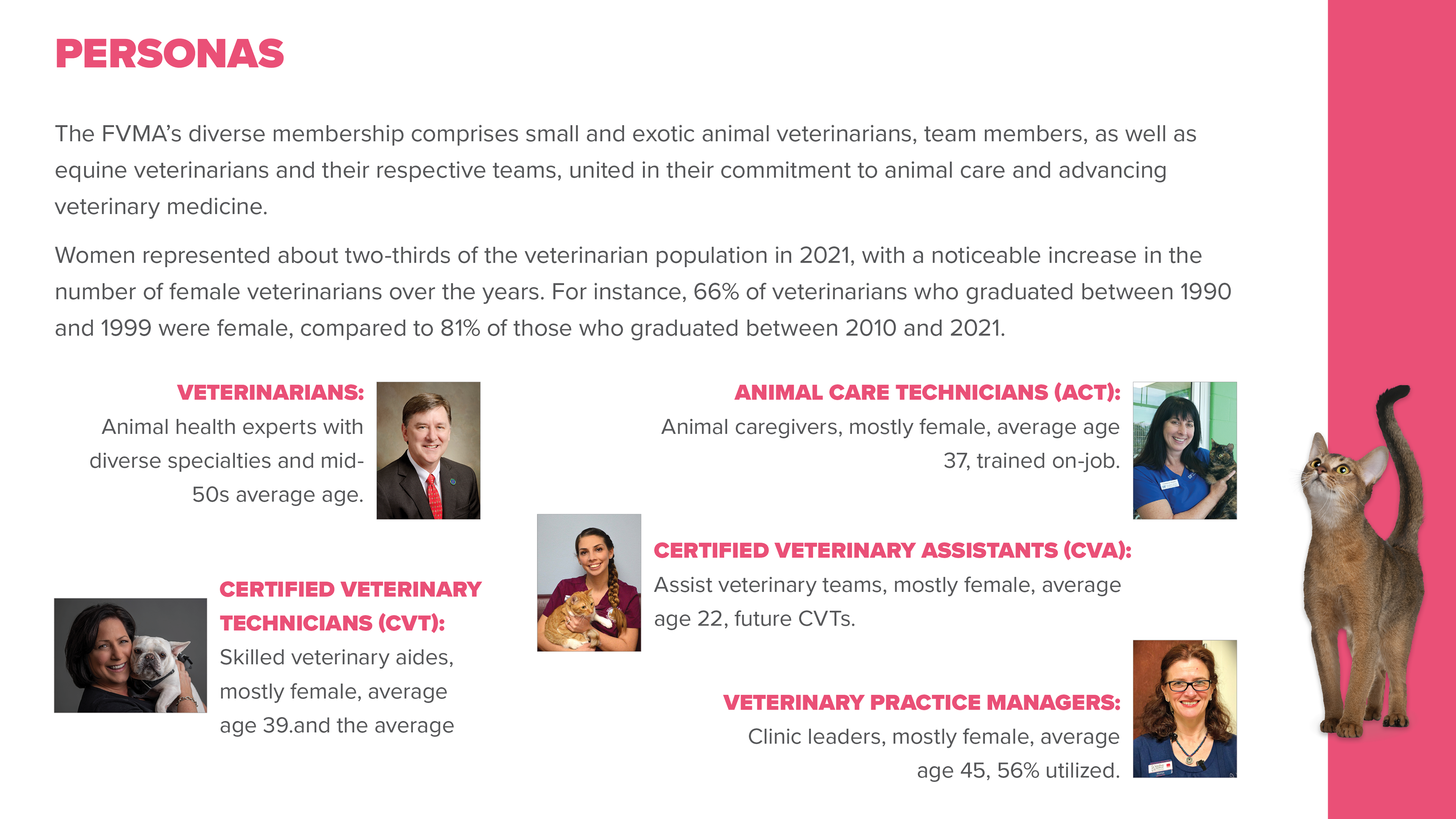
FVMA's membership is diverse, spanning five distinct professional roles — each with different goals, technical comfort levels, and relationships to the website.
I developed research-grounded personas representing the full membership spectrum:
- Veterinarians — Animal health specialists with mid-50s average age, seeking continuing education and legislative advocacy resources
- Certified Veterinary Technicians (CVTs) — Skilled clinical aides, predominantly female, average age 39, needing CE tracking and membership management
- Animal Care Technicians (ACTs) — Hands-on caregivers, mostly female, average age 37, primarily trained on the job
- Certified Veterinary Assistants (CVAs) — Entry-level team members, mostly female, average age 22, many on a path toward CVT certification
- Veterinary Practice Managers — Clinic operations leaders, mostly female, average age 45, managing team memberships and CE compliance
Notably, women represented approximately two-thirds of the veterinarian population by 2021, a proportion that has grown consistently over decades. This demographic reality shaped every design decision — from the visual tone to the information hierarchy to the mobile-first approach.
Understanding who was actually using the site — not who leadership assumed was using it — was foundational to designing something that would work.
Discovery: Research & Analysis
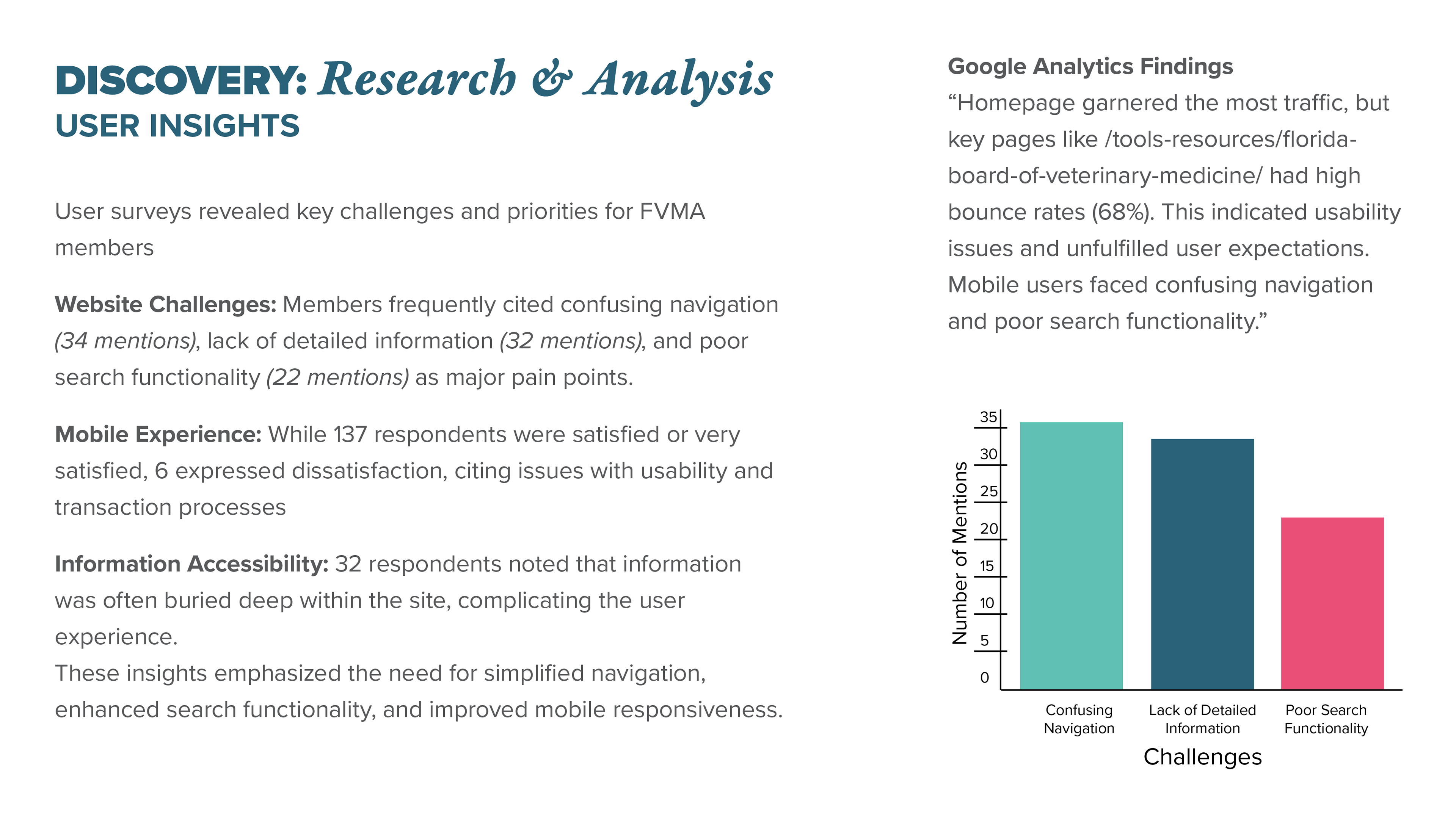
I conducted a multi-layered research process, combining quantitative analytics data with qualitative member survey findings to build a complete picture of where the experience was breaking down.
Google Analytics audit revealed that while the homepage captured the most traffic, high-value pages like the Florida Board of Veterinary Medicine resources had bounce rates of 68% — a clear signal of unmet user expectations and navigation failure.
Member surveys produced concrete, prioritized feedback from the FVMA community:
- Confusing navigation was cited 34 times as a major pain point
- Lack of detailed or findable information was mentioned 32 times
- Poor search functionality was flagged 22 times
- 32 respondents specifically noted that critical information was buried deep within the site, requiring excessive effort to locate
- Of members rating their mobile experience, the majority were satisfied — but a meaningful segment cited usability and transaction friction as ongoing issues
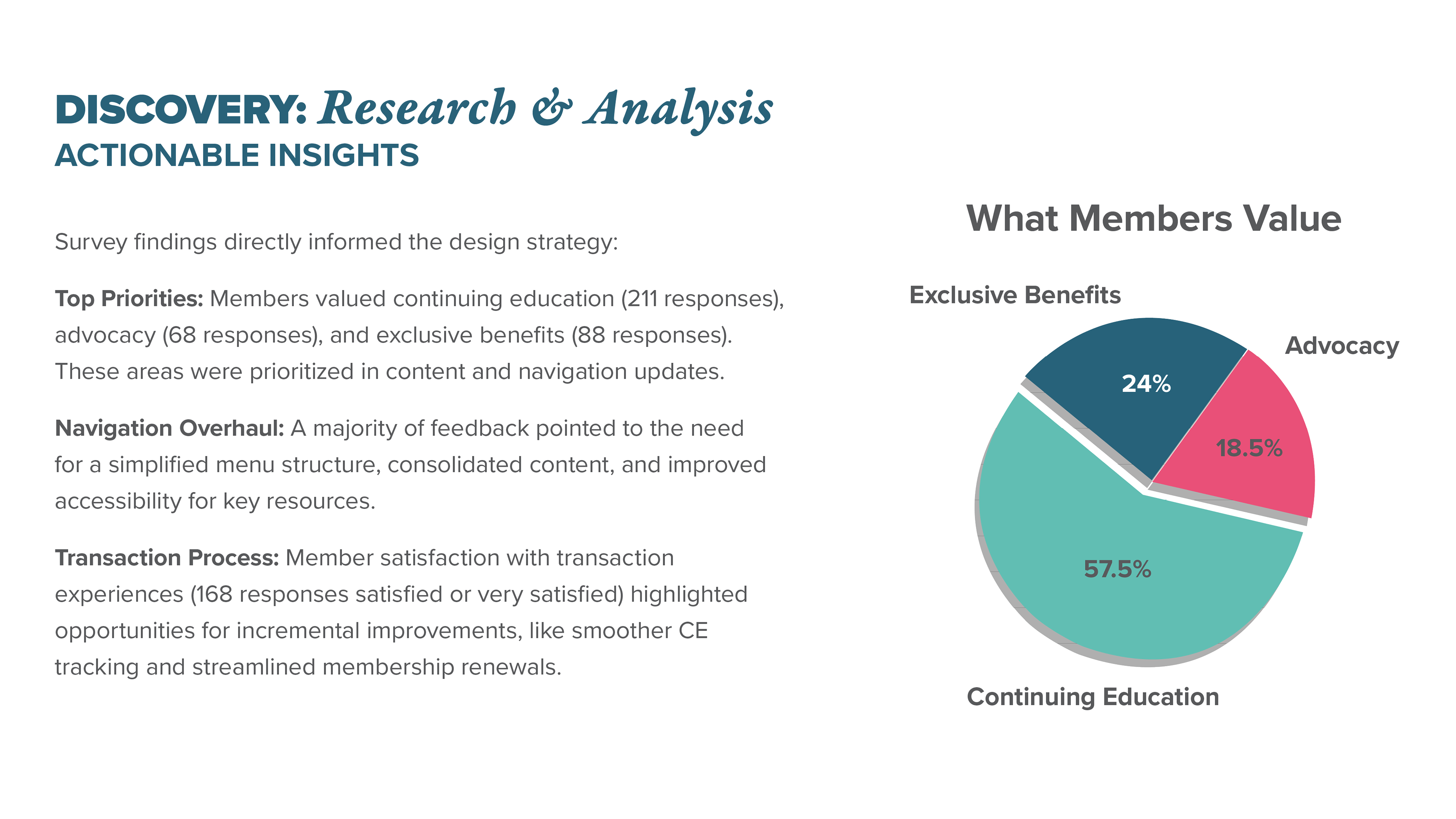
What members actually value (by response volume):
- Continuing education resources: 211 responses
- Exclusive membership benefits: 88 responses
- Advocacy and legislative support: 68 responses
This data directly shaped the navigation redesign — the menu structure needed to surface CE, benefits, and advocacy content immediately, not bury it three levels deep.
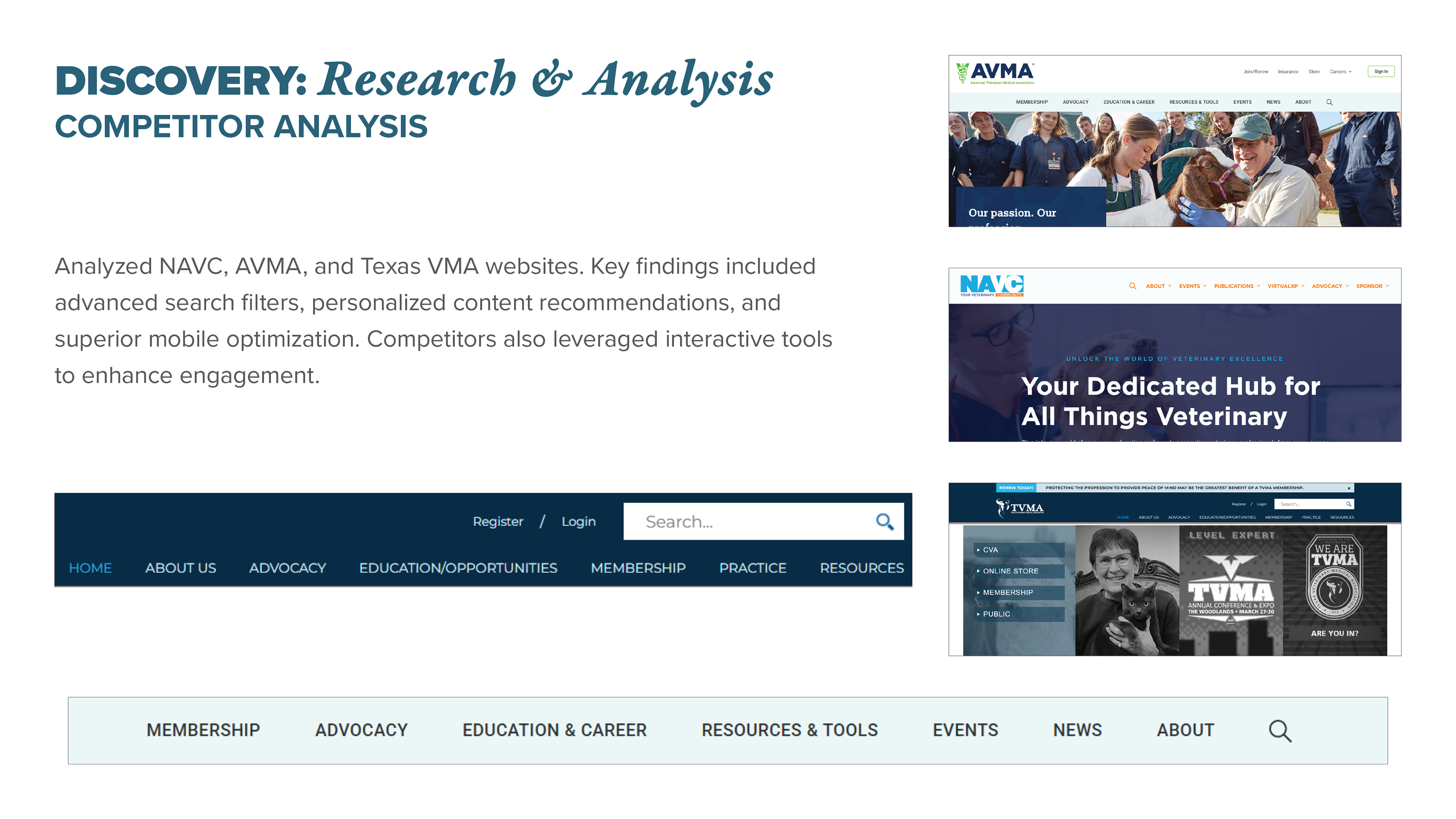
Competitor analysis of NAVC, AVMA, and Texas VMA revealed industry benchmarks the FVMA site wasn't meeting: advanced search filters, personalized content recommendations, interactive tools for engagement, and superior mobile optimization. These became aspirational reference points for the redesign direction.
Design: Strategy & Execution
With research findings synthesized into clear priorities, I moved into design — translating member pain points into specific, testable solutions.
Navigation overhaul: Restructured the menu architecture to surface the three highest-value content categories — continuing education, membership benefits, and advocacy — at the first level of navigation. Reduced cognitive load by consolidating redundant sections and eliminating unnecessary depth in the information hierarchy.
CTA redesign: Redesigned the conference registration button and surrounding page elements to create a clearer visual path from awareness to action. The registration CTA had been visually subordinate to surrounding content — a fixable problem with significant revenue implications.
Brand alignment: Unified the visual language across pages that had drifted from the FVMA brand guidelines, creating a more coherent and professional experience that reflected the organization's stature within the veterinary community.
Conversion tracking implementation: Worked with stakeholders to establish baseline conversion tracking — giving the organization data infrastructure that didn't exist before, enabling future optimization grounded in evidence rather than assumption.
AI-assisted research and iteration: Leveraged AI tools to accelerate competitive research, synthesize survey findings, and generate design directions for stakeholder review — an approach that compressed timelines without sacrificing depth.

Results
The redesigned conference registration experience — combining UX-informed navigation, a more prominent and compelling CTA, improved mobile usability, and cohesive brand execution — produced measurable, documented outcomes:
- 20% year-over-year increase in conference registrations
- $1.1 million in conference pass sales
- Improved brand consistency across all digital touchpoints
- Established conversion tracking infrastructure for ongoing optimization
These weren't design-for-design's-sake improvements. Every decision was traceable to a specific research finding, and organizational revenue data validated the results.
What This Project Demonstrates
Effective UX work at an organizational scale requires more than design skill — it requires the ability to gather and synthesize real evidence, build trust with stakeholders, translate complex findings into clear design decisions, and execute across brand, UX, and digital strategy simultaneously.
At FVMA, I functioned as a full-spectrum designer: researcher, strategist, visual designer, brand steward, and project lead. The results speak to what's possible when design is treated as a strategic function rather than a production task.