
Project Overview
The Gulf Atlantic Veterinary Conference (TGAVC) convenes veterinary professionals, educators, and industry experts from across the Gulf and Atlantic regions to connect, exchange knowledge, and pursue continuing education. TGAVC features leading voices in veterinary medicine through interactive lectures, hands-on labs, and networking experiences that support professional growth and animal well-being.
My Role
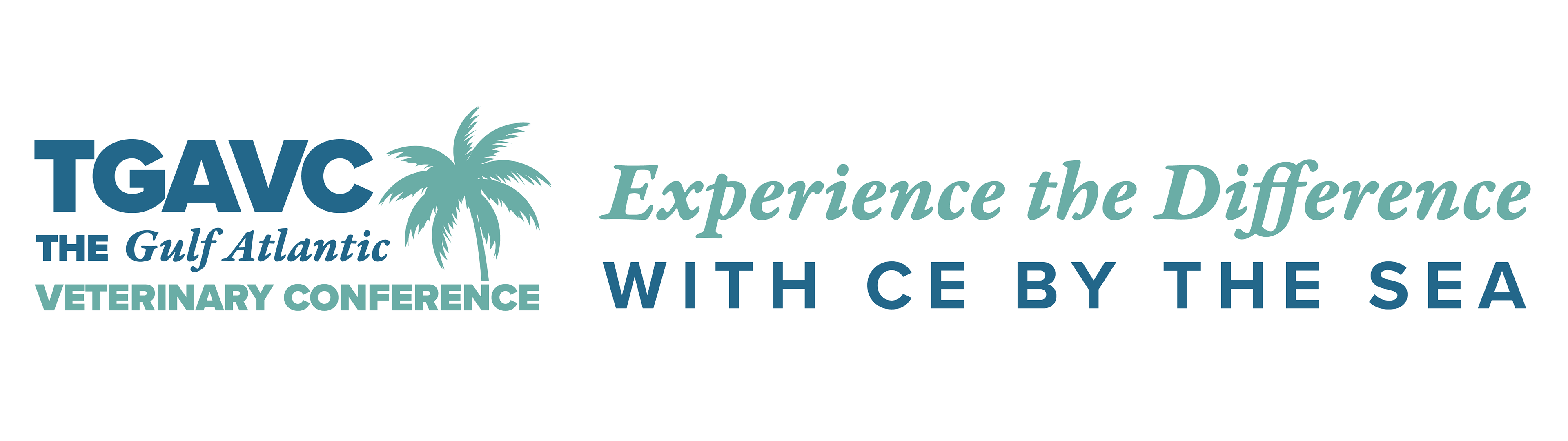
As Senior Graphic Designer & UX/UI Lead, I directed the creative strategy, branding, and visual design for TGAVC. Partnering with the Marketing and Communications Manager, I helped establish an efficient creative workflow—developing flexible templates for email and social campaigns to ensure consistency and speed for our small in-house team. My overarching goal was to honor the conference’s legacy while revitalizing its brand identity to reflect the tagline, “Experience the Difference.” This included conceptualizing the overall aesthetic and ensuring its execution across print, digital, and environmental design.
Challenge
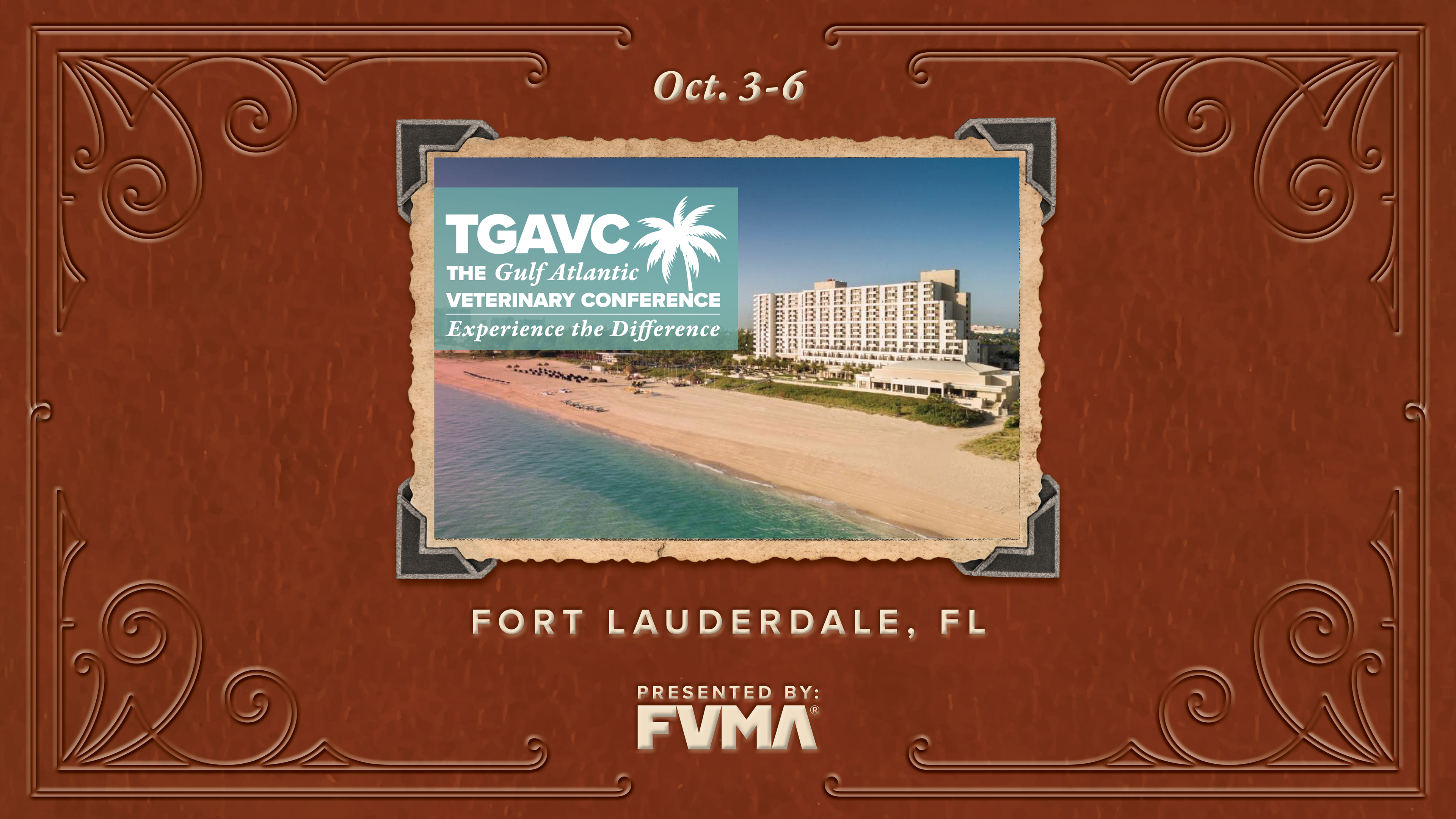
For decades, TGAVC was synonymous with The Boca Raton, an iconic 1929 venue defined by Spanish opulence, tradition, luxury, and heritage. As the conference moved to new venues such as the JW Marriott, we needed to preserve its historic prestige while projecting a fresh, contemporary image that positioned FVMA as an innovative, service-oriented leader. The challenge was to preserve the historic essence while appealing to a modern audience and positioning FVMA as a forward-thinking leader.
Research & Strategy
I conducted visual and historical research into The Boca Raton’s design language, exploring Art Deco and early 20th-century motifs that paralleled the association’s origins. I also photographed the JW Marriott to ensure that the brand visuals felt native to the new environment—seamlessly integrating FVMA’s identity with the venue’s modern coastal luxury.
Solution
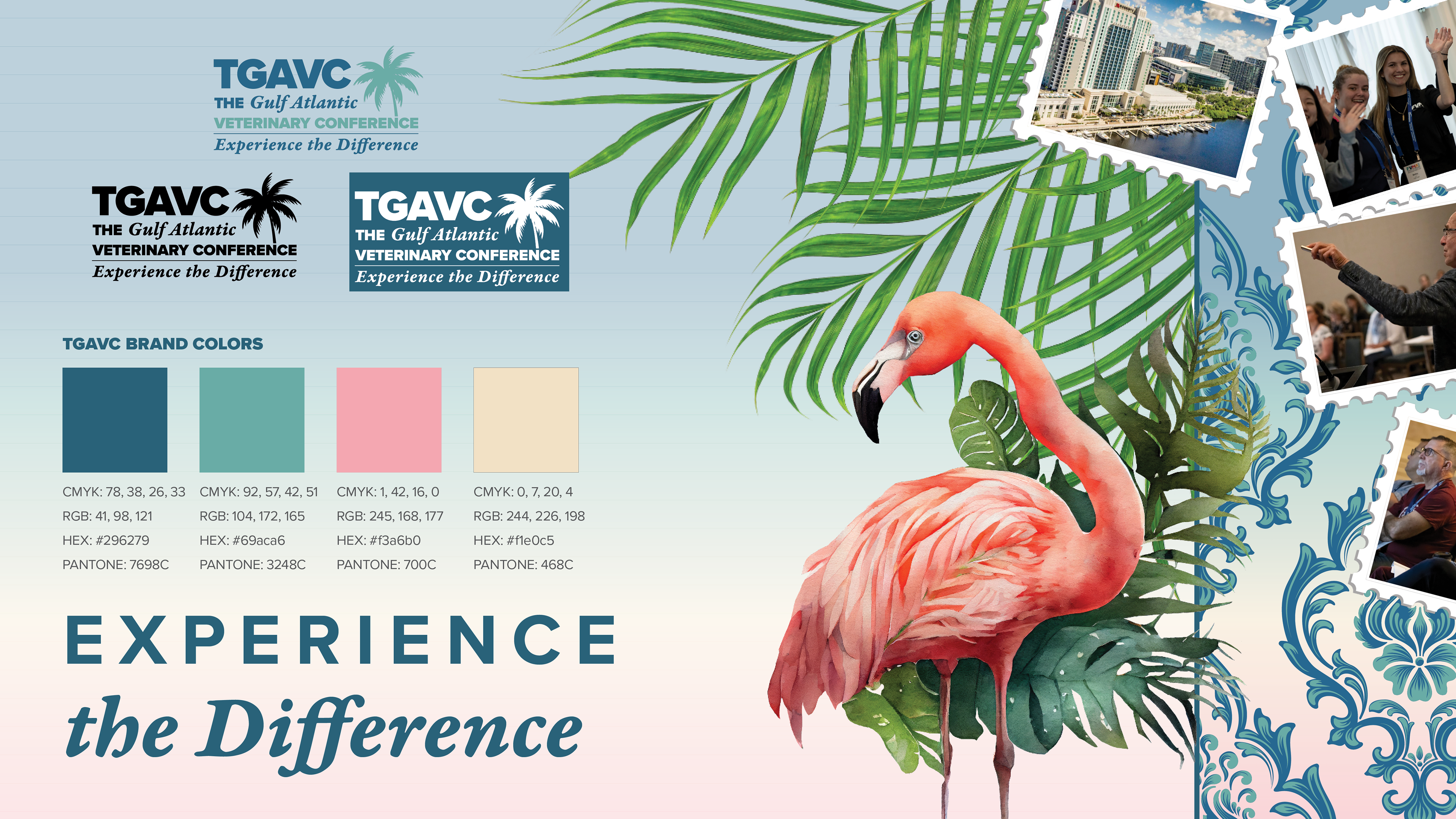
The rebrand merged heritage with modern elegance: intricate damask and chevron patterns referenced tradition, while watercolor animal illustrations, palm fronds, and a breezy coastal palette (based on variations of FVMA's main brand colors - experience the difference!) introduced a sense of vitality and approachability. Refined typography unified these elements into a sophisticated yet welcoming identity that resonated with attendees.
Execution & Results
The refreshed identity was rolled out across print, digital, and environmental applications—including pre-mailers, programs, social media graphics, and large-format signage. Each touchpoint reinforced a cohesive, high-end experience from first impression to on-site immersion. The rebrand was met with exceptional feedback, with attendees praising its “polish” and “sparkle.” Overall, TGAVC contributed to a 20% increase in event registrations and $1M in revenue, underscoring the success of the new brand direction.
Design Highlights
Branding
The resulting identity combined the glamour of Art Deco patterns with the vibrancy of a beachside setting. Visual elements included vintage postcard inspirations, palm fronds, and watercolor illustrations of animals, which added a warm and inviting tone. The typography was carefully refined to convey professionalism while maintaining elegance. The updated color palette originated from FVMA’s traditional colors, becoming soft coastal hues that bridge the gap between history and modernity.
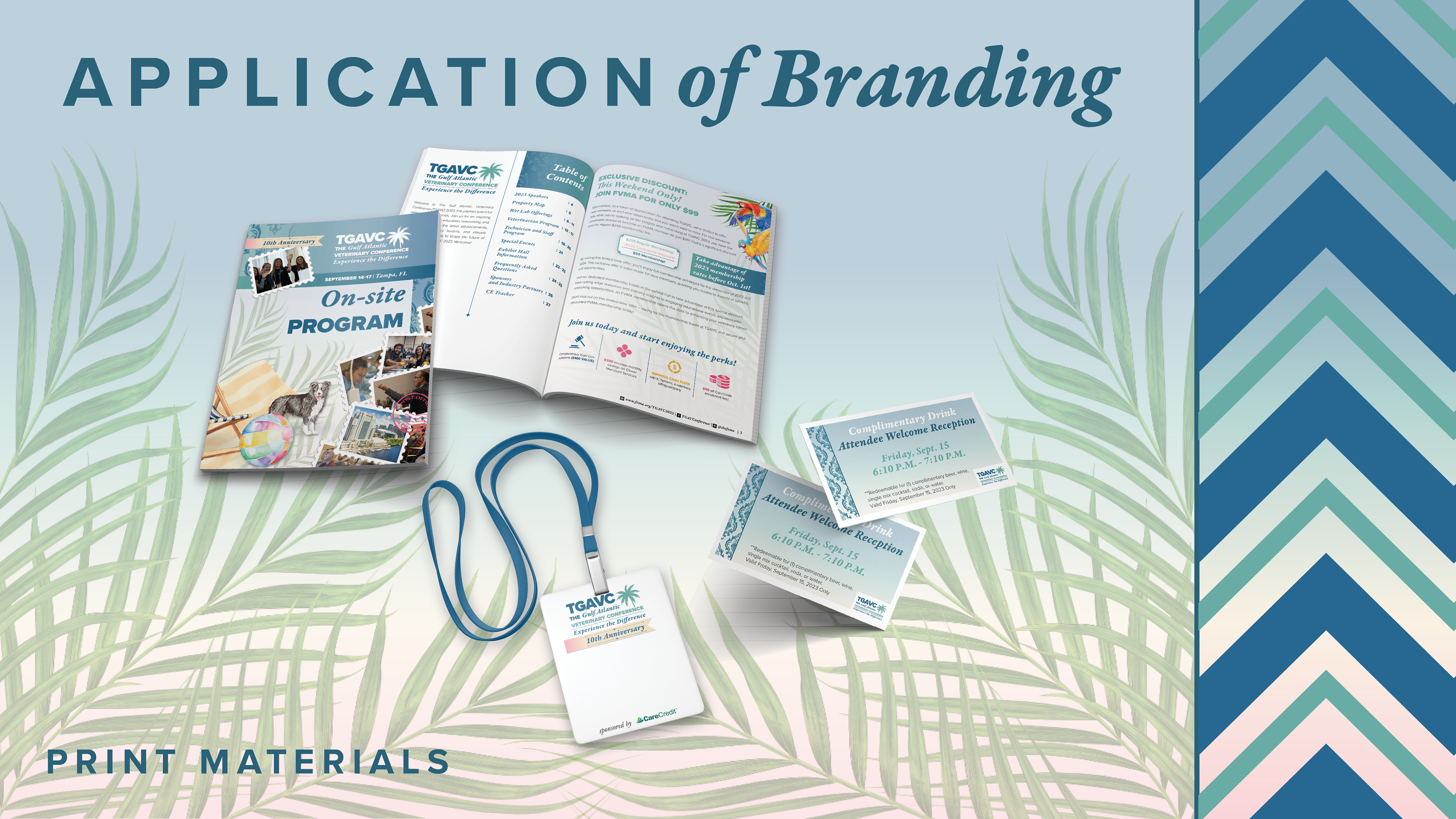
Print Materials
Pre-mailers and direct mail campaigns introduced the refreshed branding to potential attendees. On-site, programs, guides, and printed schedules carried the visual identity forward, ensuring a consistent experience across all physical touchpoints.
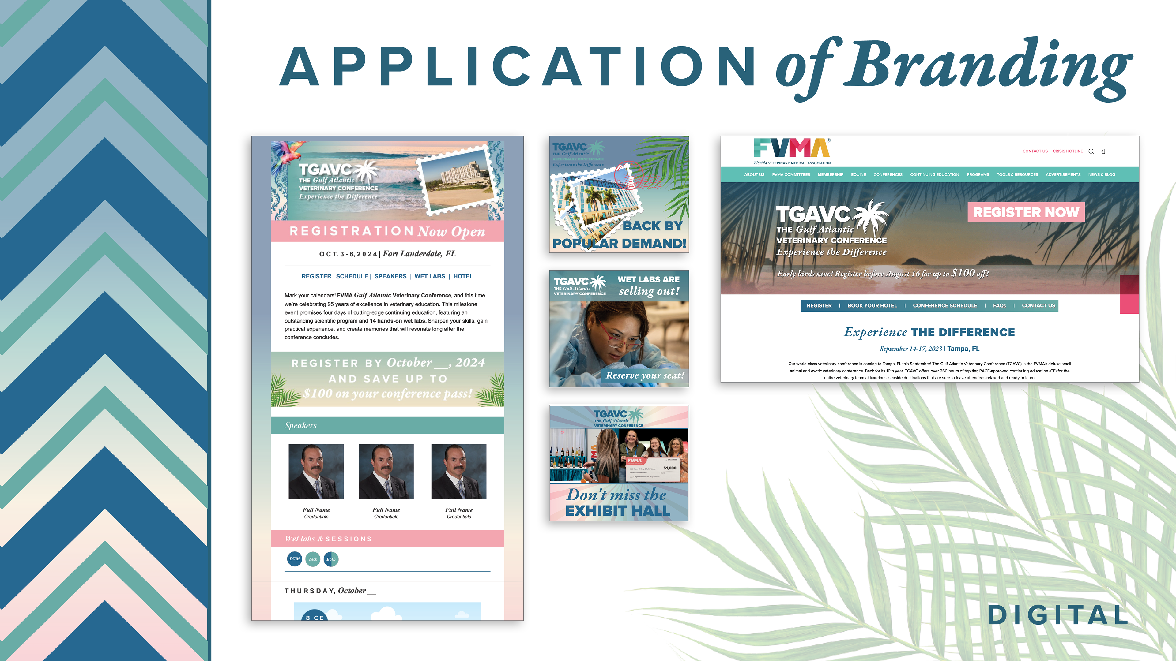

Digital Assets
The branding extended seamlessly into digital spaces. Social media graphics, web collateral, and email headers were designed to create excitement leading up to the event. Canva templates were developed to enable the conference team to quickly produce additional digital assets while maintaining consistency with the brand system.
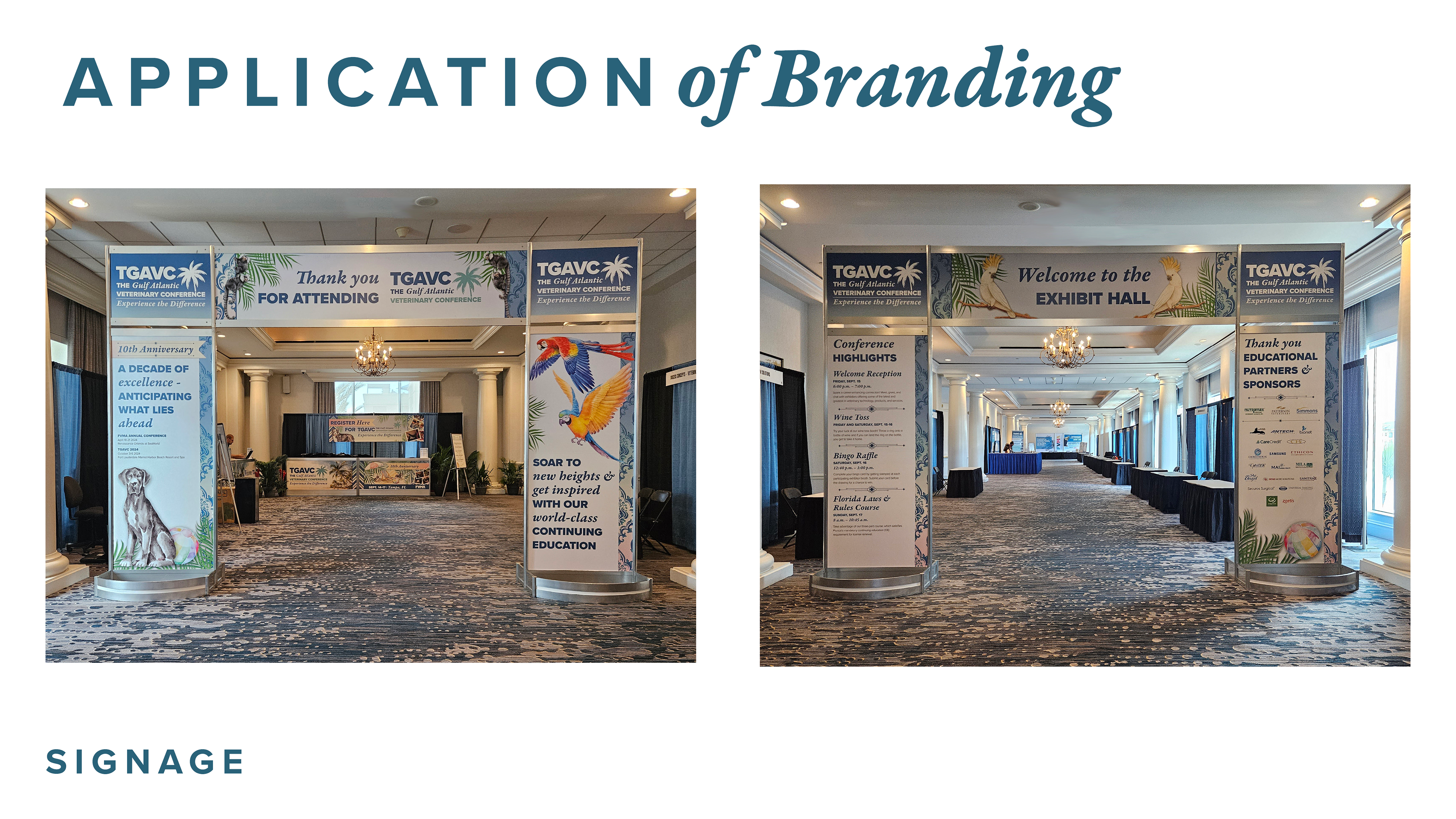
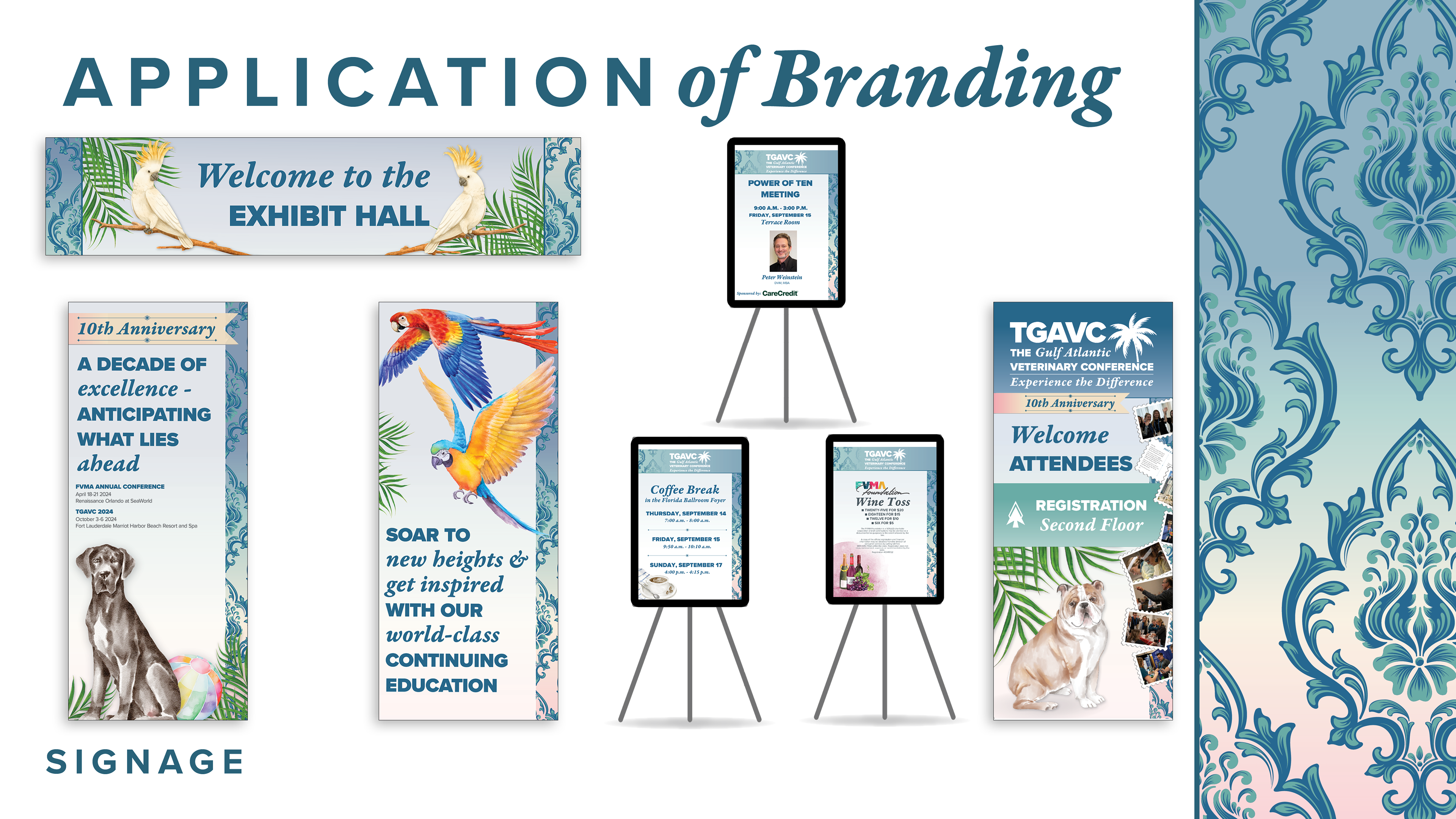
Conference Signage
The identity came to life at the event through large-scale banners, directional signage, and informational displays. Every piece was designed to both orient and inspire attendees, creating an environment that felt both professional and celebratory.
Design Philosophy
This project embodied my design philosophy of honoring tradition while pushing forward with modern innovation. The work respected TGAVC’s storied past, but it also created space for evolution, ensuring the conference felt relevant and exciting in its new setting. By weaving together historical references, coastal elements, and a refined visual style, the design struck a balance between heritage and progress.
Process
My process began with in-depth research into TGAVC’s history and The Boca Raton’s unique character. From there, I experimented with patterns, colors, and illustration styles that could carry forward this legacy in a modern context. I explored typography treatments that would complement the event’s sophisticated positioning, then refined the visual identity through mockups and production across multiple media. At every step, the focus was on creating a seamless and cohesive brand experience.
Outcomes
The branding was well-received by both FVMA and attendees. The creative approach, particularly the integration of Art Deco elements and the refined typography, was praised for effectively capturing the event's unique personality. Many attendees noted the elegant and eye-catching design, appreciating the added elegance and distinction to the conference. The refreshed branding contributed to a measurable result as well, with attendance at the 2024 conference increasing by approximately 20 percent. The identity not only balanced TGAVC’s historical roots with its new beach-inspired direction but also positioned the FVMA as both a guardian of tradition and a leader in innovation.
Reflecting on the project, I am particularly proud of how the final branding honored TGAVC's storied past while propelling it into a vibrant, modern context. The branding will continue to be used in future conferences, with room for evolution to keep the event fresh and relevant. This project underscored the importance of balancing historical respect with forward-thinking design—a challenge I embraced and executed with a creative and strategic approach. The positive reception and the significant increase in attendance further validated the success of the branding, and I look forward to applying these lessons to future projects.
Tools Used
Adobe InDesign and Illustrator were used for branding, illustration, and layout. Canva was incorporated to create quick mockups and flexible social media assets while maintaining brand consistency.